
Why We Love Pale Oak by Benjamin Moore
If you’ve followed us for any length of time, you know we have a deep love for soft, livable neutrals-those colors that work hard in a space without screaming for attention. One of our all-time favorites? Pale Oak by Benjamin Moore. This beautiful warm greige has become a go-to in so many of our projects, and for good reason.
The Perfect Balance of Warm & Cool
Pale Oak is what we call a “chameleon neutral.” It has just enough warmth to keep a space feeling inviting, yet enough gray to feel sophisticated and fresh. Depending on the lighting, it can lean slightly warm (perfect for cozy bedrooms and living rooms) or more crisp and clean (ideal for kitchens and bathrooms).
We love that it’s not too yellow, not too gray-the Goldilocks of paint colors!
Why We Keep Recommending It
Versatility: Pale Oak plays beautifully with whites, wood tones, stone, and metals. Whether we’re pairing it with creamy cabinets, dark bronze windows, or natural oak floors, it just works.
Soft Contrast: It’s light enough to feel airy but has enough pigment to ground a space. We often use it for walls when we want a subtle, elegant backdrop.
Timeless Appeal: This isn’t a trend color. You won’t regret it in two years when the “color of the year” shifts. Pale Oak is here to stay.
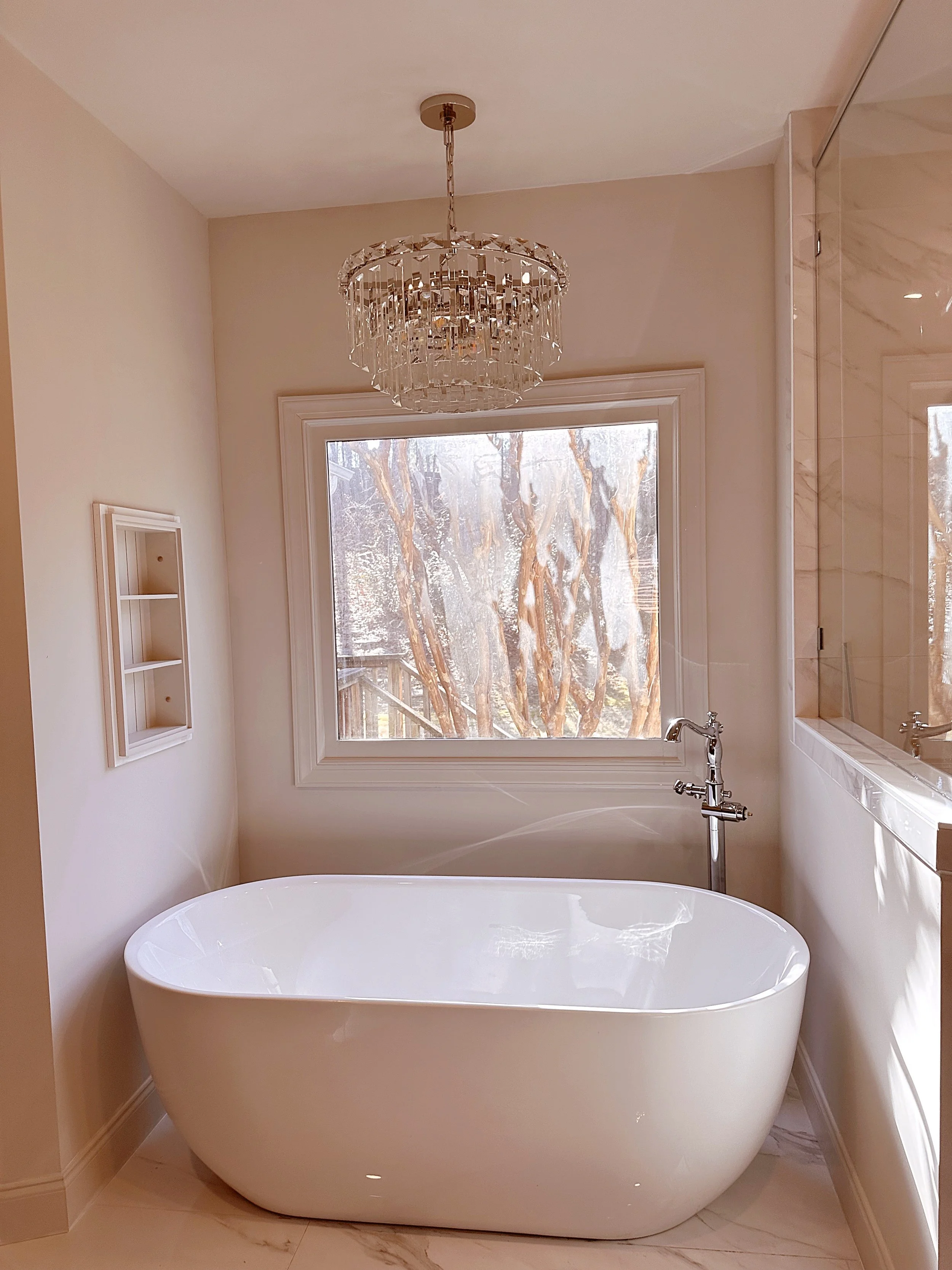
This was a master bathroom we completed with Corley Building Company, and we used Pale Oak for the walls and trim. It gave the space such a warm, neutral feeling.
Our Favorite Ways to Use It
Whole-Home Wall Color: Especially in open floor plans, Pale Oak flows beautifully from room to room.
Cabinetry & Built-Ins: Paired with warm brass or black hardware, it creates a soft, sophisticated look.
Bedrooms & Bathrooms: When you want calm, cozy, and refined, this is the shade we reach for.
Design Tip: Test It in Your Space
Like with any neutral, lighting makes a difference. We always recommend painting large swatches and looking at them throughout the day-morning, afternoon, and evening. Pale Oak will surprise you in the best way as the light shifts.
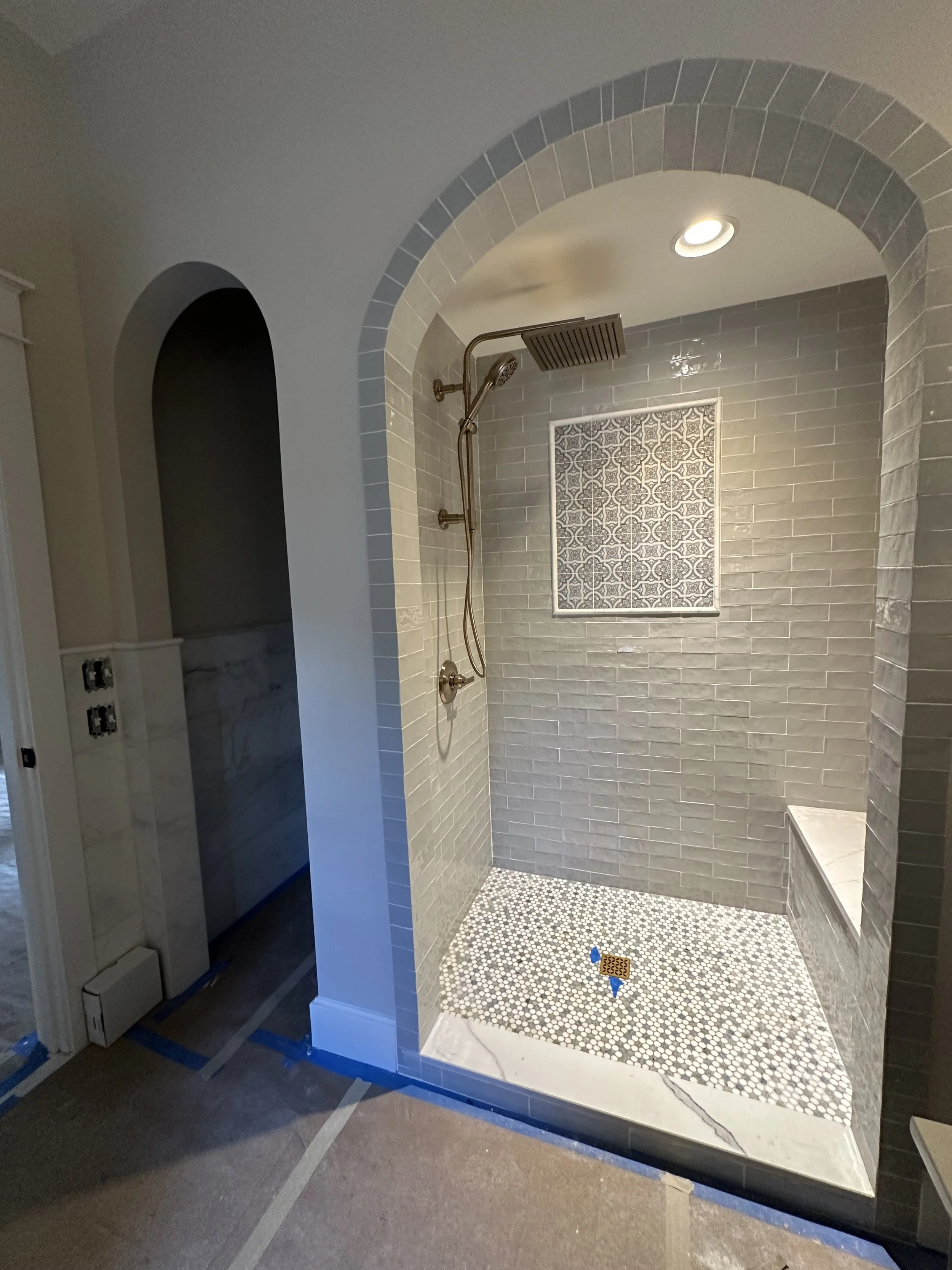
This bathroom is not quite finished yet, but we also used Pale Oak to create a warm contrast against the blue/gray tile.
Love,
Lindsay