
The New Color Story: Why Unexpected Pairings Are Making Interiors More Interesting
For years, interior design followed a fairly predictable approach to color. We chose a palette, found a few complementary shades, and made sure everything worked together.
But something interesting is happening in interiors.
We’re seeing colors paired in ways that once might have seemed completely unrelated. And the results are some of the most beautiful, sophisticated spaces I’ve seen in a long time.
Think oxblood with powder blue. Olive green with cobalt. Butter yellow with burgundy. Dusty lavender with tobacco brown.
These aren’t necessarily combinations that immediately come to mind when selecting a color palette. But that’s precisely what makes them interesting.
The Beauty of an Unlikely Pairing
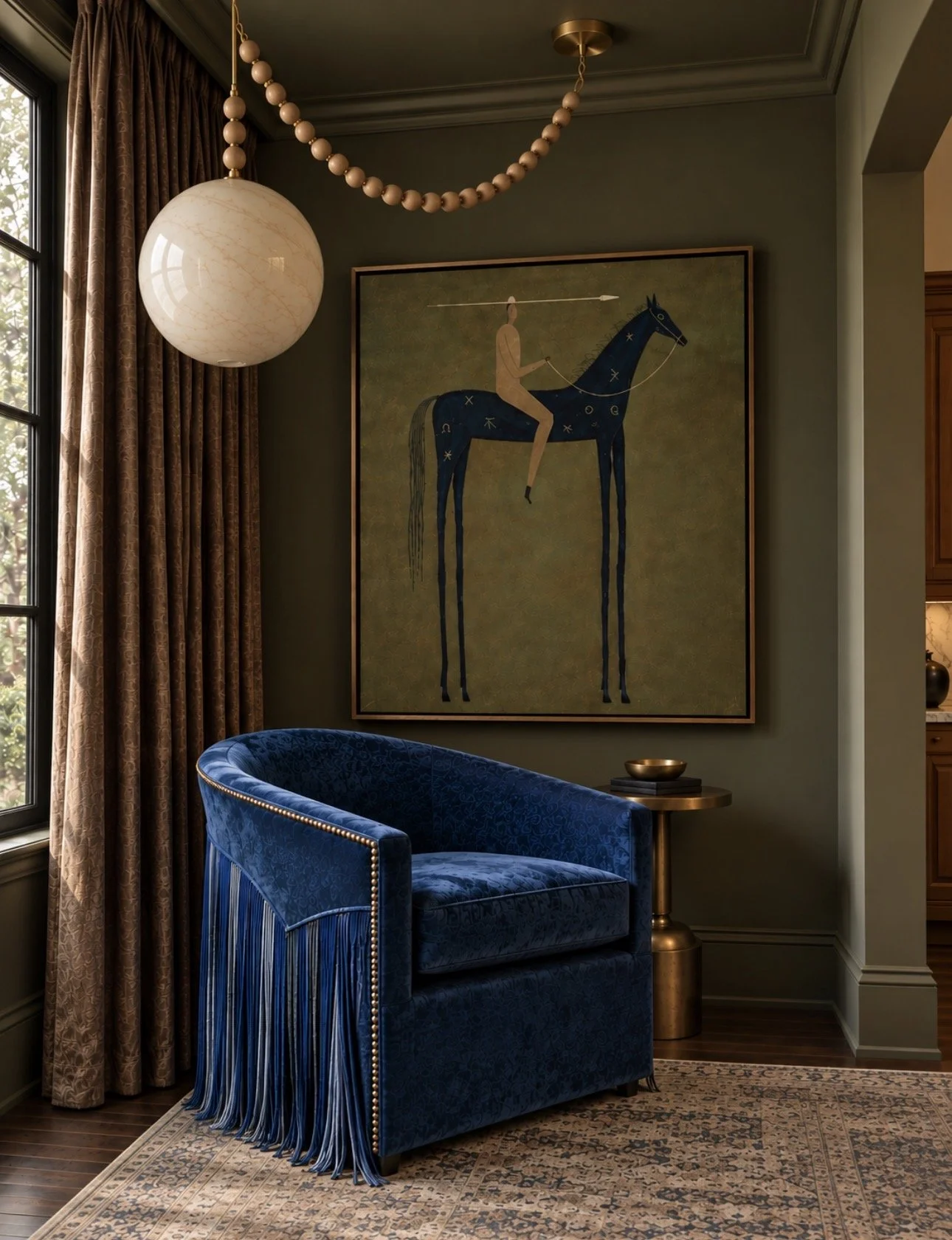
Take this little corner, for example.
The richness of the olive walls, the saturated blue chair, the warm blush and tobacco tones in the drapery, and the softness of the rug all bring something different to the space.
Nothing is overly coordinated, yet everything feels connected.
And that’s what I find so fascinating about this shift in color.
We’re moving away from the idea that a room needs one dominant color with a few predictable supporting shades.
Instead, we’re seeing palettes that feel more nuanced. More layered. Almost as though the colors have been collected over time rather than selected from the same paint strip.
It’s Not Always About Brighter Color
One misconception about using unexpected combinations is that everything needs to be bright or saturated.
Actually, some of my favorite pairings involve colors that are slightly muddy, muted, or difficult to describe.
A brown with a hint of plum. A green that leans toward charcoal. A blue that feels almost black.
These complex colors have a way of making even the most surprising combinations feel sophisticated.
And when you introduce a single clear, saturated color into that environment, it becomes something really special.
The Secret Is in the Undertones
Of course, there’s a difference between an unexpected combination and one that simply doesn’t work.
Undertones, saturation, proportion, and the surrounding materials all play an important role.
A vibrant blue might feel overwhelming against a stark white wall but incredibly beautiful surrounded by warm wood, aged brass, and earthy green.
The context changes everything.
It’s one of the reasons I rarely select colors in isolation. I want to see how they interact with the fabrics, artwork, finishes, and natural light in a room.
Sometimes the color that seems least obvious ends up being exactly what the space needs.
A More Personal Approach to Color
What excites me most about this direction is that it opens the door to more individual interiors.
We don’t have to choose between an entirely neutral home and one filled with bright color.
There’s a beautiful middle ground where deep, earthy shades coexist with unexpected pops of color. Where traditional finishes meet contemporary palettes. Where the combinations feel fresh without becoming trendy.
And perhaps that’s the most interesting part.
The future of color in interiors may be less about which individual shades are trending and more about how we choose to put them together.
At House of Life and Love, that’s a conversation I’m excited to keep exploring.
Because sometimes two colors that shouldn’t work together turn out to be the most beautiful combination in the room.
Love,
Lindsay